Be My Guest Part 1: The Guest Bedroom at The Dollhouse!
As I’ve stated in pretty much all of my decor posts since I moved about a year ago into my new home, I wanted my whole house to be all-white. I reasoned with myself saying: “Now Ingrid, you know your whole entire house can’t be white! You’ve got to add some color in somewhere.” More about that later. Typically, like most home owners, the guest bedroom is the overflow room; overflow of all the items you couldn’t use throughout the other parts of your house, complete with mismatched furniture, your bed from back when all you had was a bed, and a closet full of items that belonged in storage or somewhere else other than the guest bedroom closet. I always said I’d never have a guest room like that, so from my very first home until now, I’ve been diligent about sticking to that. This one’s been tough though, because The Dollhouse is a lot smaller than my last home, (I know, I’ve said this repeatedly), and I struggle to manage adequate storage, especially since I have no hall closet, my office closet is filled with all of my office-y stuff, and don’t get me started on the size of my Not-so-Master, Master Closet. You can read about those woes here. So, end result… my coats, (which aren’t many because I live in Arizona), are in guest bedroom closet, along with two suitcases, but there is still plenty of room for guests’ wardrobe items to be stored. Whew! And there wasn’t much to do in this room by way of outfitting it either, because one, it’s so small, and two, I was using the same pieces from my last guest bedroom…
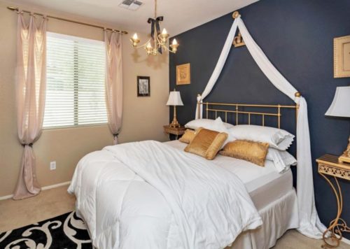
I know it looks like the same room, almost, but it was larger for sure. And It always amazes me how photographs sometimes don’t translate colors; what the room actually looks like. For instance, that wall was a lot darker “in person”, like, almost black. And the curtains were the same color as the walls which in-person looked a lot lighter… oh well, moving on Ha!♥ Here is what my new guest bedroom looked like on move-in day…
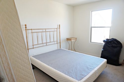
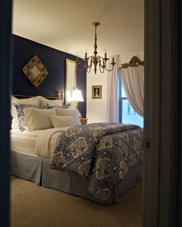
Pretty basic, huh? I know. And it’s the only “before” photo I have of that space. I’m so focused on the end result that I don’t think about the before shot until afterwards. I know I’ve said it A LOT but I’ll say it again… these rooms are TINY! Thank goodness I didn’t have a lot of furniture that had to fit in there! The closet doors are behind the mattress that’s leaning there on the left. The gigantic black trash bag you see there, (that doesn’t look so gigantic in the photo), had all my pillows in it. For 8 months while the house was being built, I went back and forth on how I wanted this room to look. I entertained a blush color so I’d represent my beloved pink family somewhere in the house, but in the end, I didn’t want a feminine guest bedroom, so blush was definitely out. Still clinging to my “all-white-everything” for my new home decor, I perused tons of magazines and Pinterest posts for inspiration and… nothing. I finally stumbled upon and fell in love with a particular Ralph Lauren comforter set I saw at T.J. Maxx, and then all that all-white stuff changed… well, sort of. It was a color I would’ve never considered before and I was thrilled to be stepping outside of my own decor box. I decided I wanted the room to have a regal feel to it. I’m very pleased with how it turned out. This is what it looks like now…
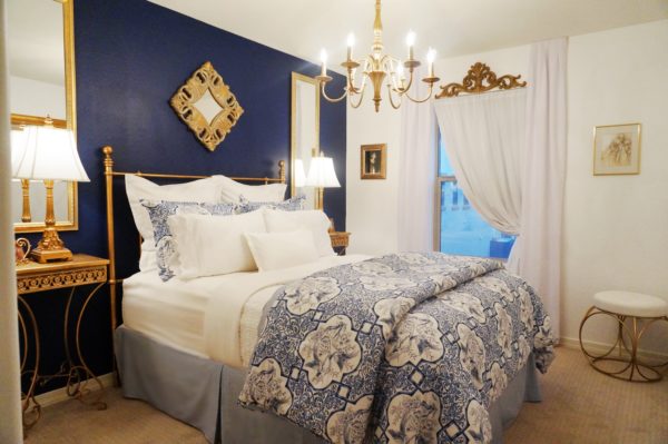
Again, the accent wall color photographs differently than the way it looks in person. The blue isn’t quite that vibrant, but it is bold. Guests that have stayed here so far have really liked it, so that makes me happy, because that’s what it’s all about, right? Making your guests feel welcome and comfortable in your home.
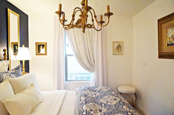
It’s still bright white, but with just enough color. Although my mom’s artwork, full of lots of color, dons the hallway walls upstairs, the guest bedroom is actually the only room in the house that has a pop of color.
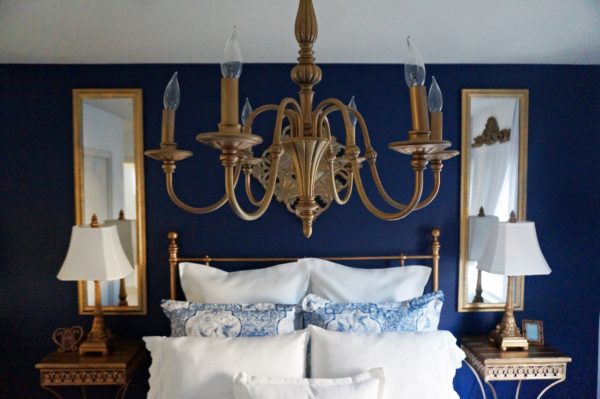
Sometimes I just walk into this room and look around for a few minutes. It feels warm and cozy, yet bright and joyful at the same time. A few people have claimed this room as their own. I won’t name names, haha! And I’m sorry my pillows may look a bit out of sorts. I haven’t yet mastered the art of making the room look picture perfect for print.
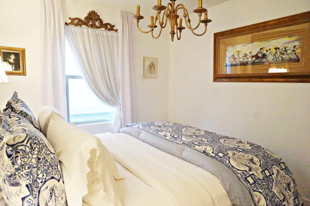
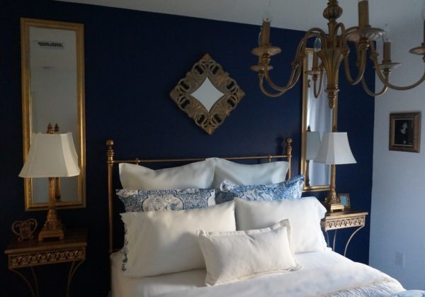
I did try to take some shots with more daylight, but the position of the window with the bright light coming in wouldn’t allow me to. I’m not that good a photographer to be able to manipulate the lighting in order to capture the shot correctly. The painting on the right wall there is a print by an Atlanta-based artist named Roderick, called “The Wedding Procession” that was gifted to me by my Mom back in 2000. I just love the colors in that painting. I created the window treatment (my favorite decor thing to do), with gauze and linen fabric, and the gold wall piece above the window from Hobby Lobby. I added the little stool from Marshalls. I don’t know where I get it from, but I always believe there should be some sort of seating in a guest room, no matter the size of the room. The mirrors are re-purposed from the foyer of my last home. Adding something of height always dramatizes a room, and mirrors help make small spaces appear larger. The chandelier is also re-purposed, but from the dining room of my last home. It was an antiqued silver/grey color before I spray painted it gold. No news here… that I re-purposed some things with a can of spray paint, haha!
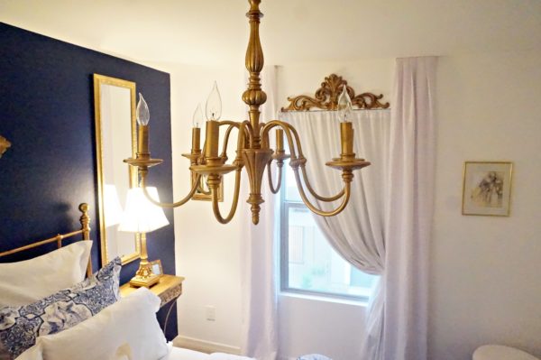
This was the first room I completely finished in the house, and I did it in just 2 1/2 days, working in the evening when I got home from work. Once the vision comes together in my head and I have all the pieces I need to execute, I’m a bit consumed and driven to get it done. I like that this room ultimately brings a little color into my home. But I also like that if I decided to go back to my original all-white theme, I could do so with little effort by priming and re-painting that one wall and switching out the comforter set. This will more than likely be the room where I “play” with color the most because it’s easy.
Thank you for being my guest as I shared the processes of decorating my latest guest bedroom. Leave a comment below and let me know your thoughts and preferences on color in your decorating. Until next time…
The C Word Book
Now Available Here!



Ingrid,
I Love the Combination of the Blue and White. Beautiful as expected.
Thank you Miss Peggie! You more than most, know how much I wanted an all-white-er’ythang house, haha!!! Love you :)xo