Changes at The Queen's Quarters

Change is good at The Queen’s Quarters! Either I’ve been too invested in checking out fabulous designer closets on Instagram and Pinterest, or I really was feeling a little blah about my master closet, mainly one side of it. You can check out the original reveal HERE. But here are the areas of the space that were speaking “change” to me…
The boutique shelving styling seemed a little crowded for me…
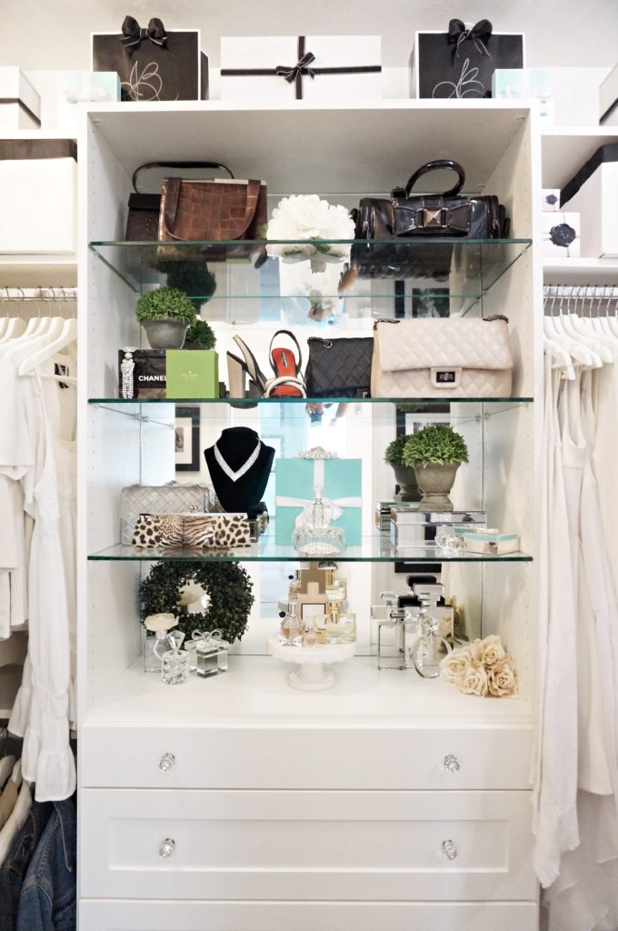
I was tired of the black and white with a hint off Tiffany blue/green on the top shelf too…
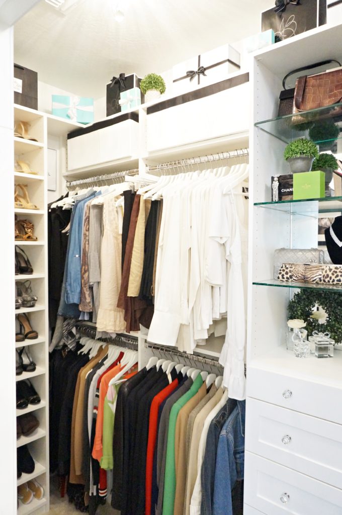
It all started when I found out I couldn’t take the built-ins to the ceiling and add a crown molding. The way the attic crawl space entry in the ceiling is situated, prevents a crown molding from being able to go here…
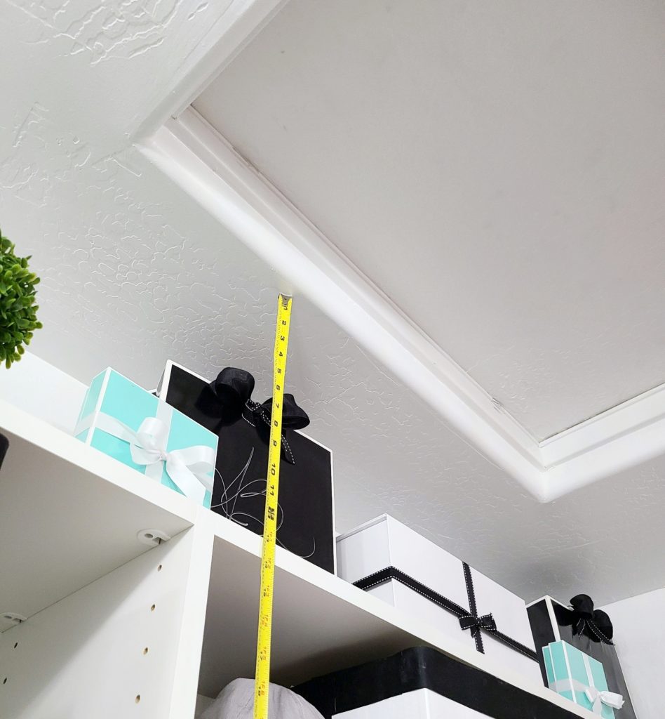
Now I Love It!
I can’t tell you how long I stood in this room staring at everything, plotting what I was going to do. Everything I wanted to do seemed either too expensive or just couldn’t be done… like the crown molding. It is one of the things I’ll remember when I’m designing my next closet, or one of my client’s closets. I knew I wanted some drama… no surprise there. I knew I wanted something similar to a vanity in there, and a real valet rod. Everything else just came together after I figured that out. So here’s the finished space…
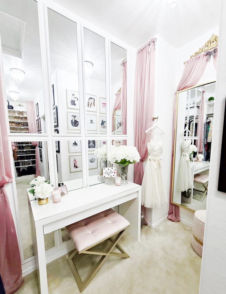
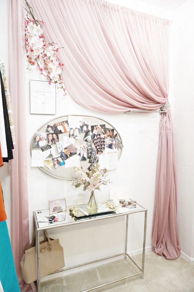
The vanity table is from IKEA, the mirrors are from Target, and I used the same fabric, just a little differently, to switch things up a bit. I purchased the valet rod on Amazon.
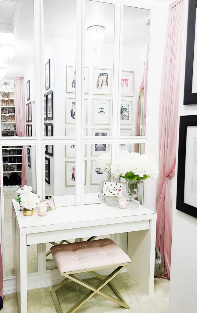
I was just going to center four mirrors over the vanity table when I had a crazy idea to stack them, giving it a sort of mirrored wainscoting look that I absolutely LOVE!!! Here’s the other portion of the space…
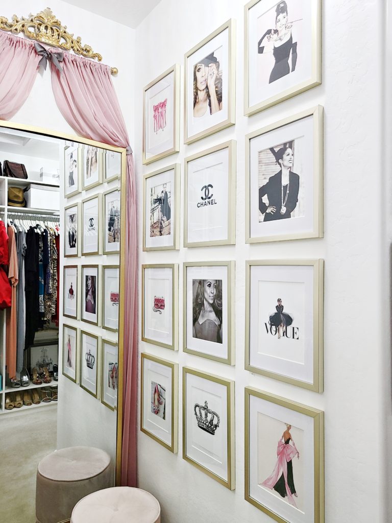
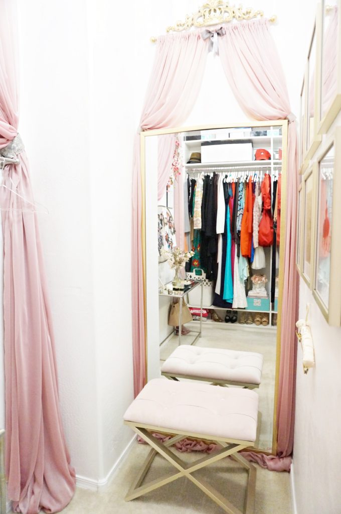
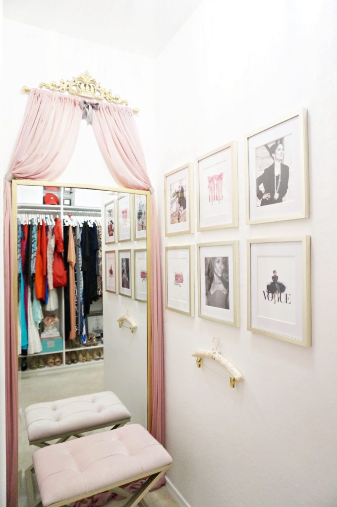
I raised the full-length mirror and lifted the art decor piece and fabric, and moved the small round ottoman from over by the shoes to this corner. I also added two more rows of framed photos to the other wall. To me it added a little more… you guessed it, drama! And just a few more changes on the other side of the closet…
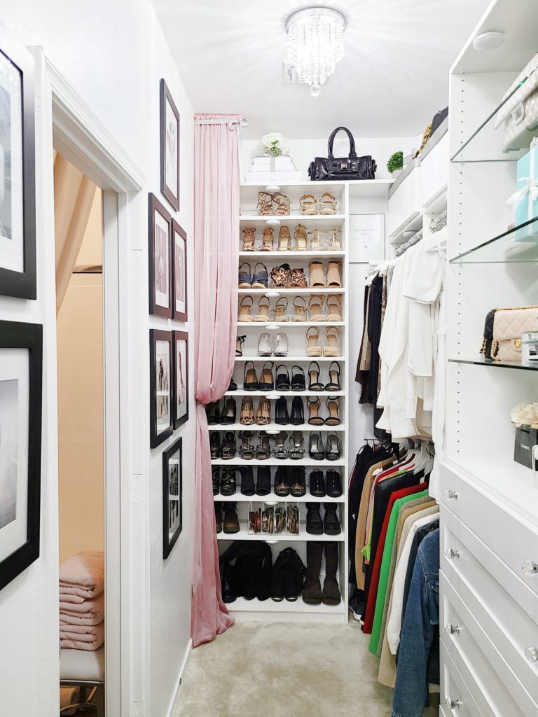
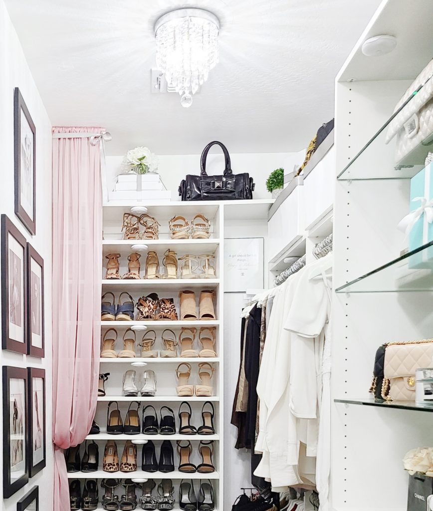
The only thing different here is the fabric added to the side, and the styling on the top shelf. I also changed all the ribbon detailing to on the decorative and storage boxes on the top shelves, from black to grey, and it seemed to have given it the softer look that I wanted.
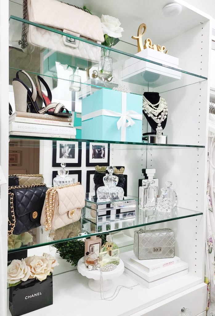
Finally, I minimized the styling on my boutique shelving. It’s just a cleaner look to me.
I’m sooo enjoying my newly re-done closet, and have “noted for next time” another thing I’ll make sure I do when designing another closet. Along with making sure I can take my customized units to the ceiling and add crown molding, I’d like to have the depth of the built-in panels extended so the clothes don’t stick out past them.
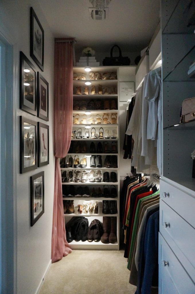
After the original reveal I added lighting that I totally fell in love with. With the changes I love it even more!. You can see how my “lighting install” came about HERE.
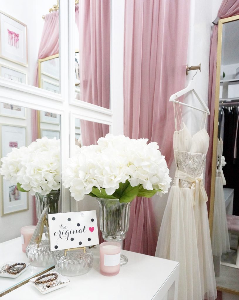
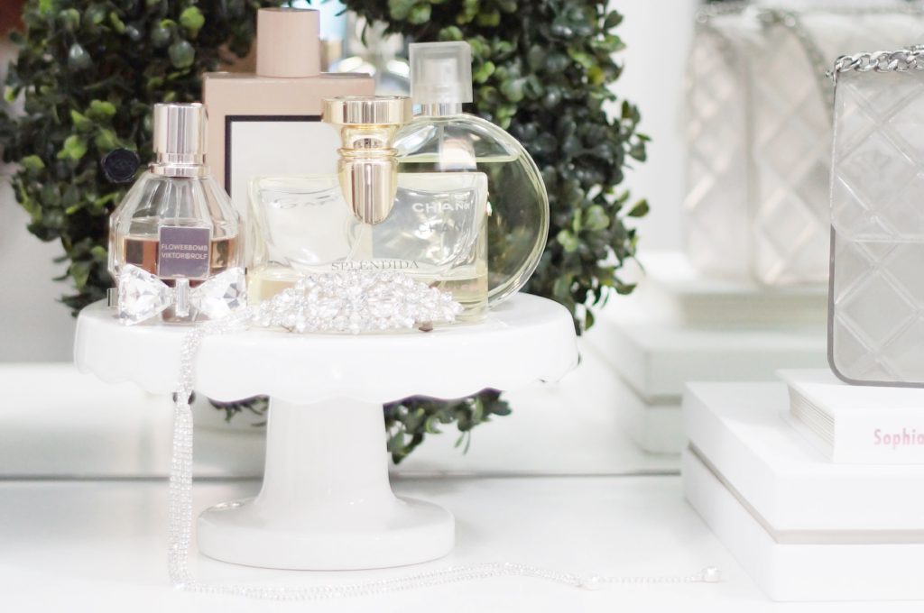
(Closet built-ins by Closet Factory – Closet Designer, Lauri Wright – Styling and Organizing by me.)
It really do believe every woman deserves a space to get dressed in and prepare for the day, that feels lovely to her. Soon, I’ll be able to help you achieve just that. Stay tuned for an announcement in coming weeks… ok maybe a couple months :)xo


Everything looks exquisite! It is very organized. I love it. You are a very creative person and has the knack for putting together. Well done!
Carol, thank you so much! This is my passion and I’m so glad you “stopped by!” 🙂
Class, style, sophistication, and of course beauty, Your décor is exceptional as usual as you are. your new photo is very nice too!! Muchlove!!
Thank you Cousin! I’m so grateful for your kind words and continued support :)xo